No one can keep up with fashion. Every day new designs are created, and of course, some can turn out to look ridiculous. Every designer wants to be edgy, to create something that has never been seen before, and with that whole process, mistakes will be made.
Sometimes it takes some time for someone to realize what he is actually seeing, so most of the time, people will take photos of funny clothes and post them online. We have searched online for some ridiculous fashion blunders, and we hope they will make you laugh.
1. Born to skate/chill
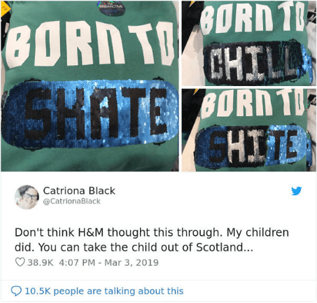
The design team should have seen this one coming.
2. Anti or not?
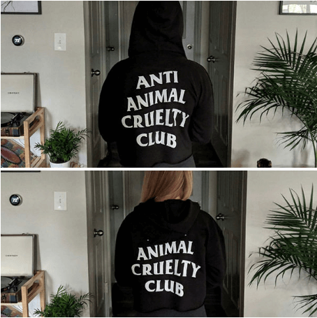
Well, the hood always has to stay up.
3. Wrong position
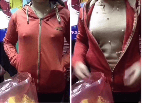
Maybe those pearls didn’t have to go there.
4. Touch or don’t touch
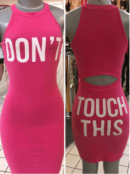
Make sure to read both sides.
5. Design or accident?
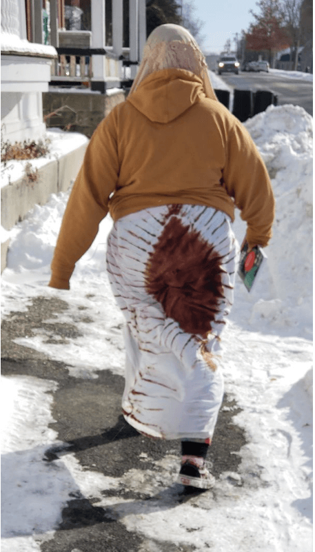
Make sure to check what you are wearing before going out.
6. An appropriate dress

Those dots are in the wrong place.
7. Too many fingers
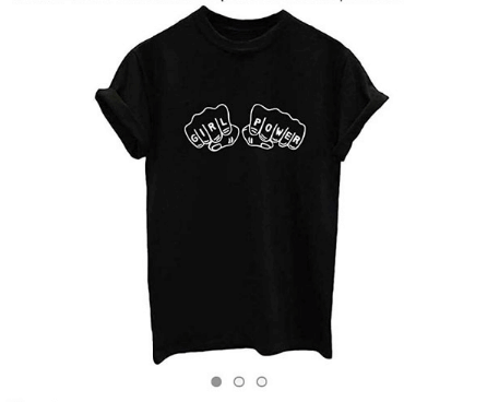
Great message, awful design.
8. Where is the Eiffel Tower located?
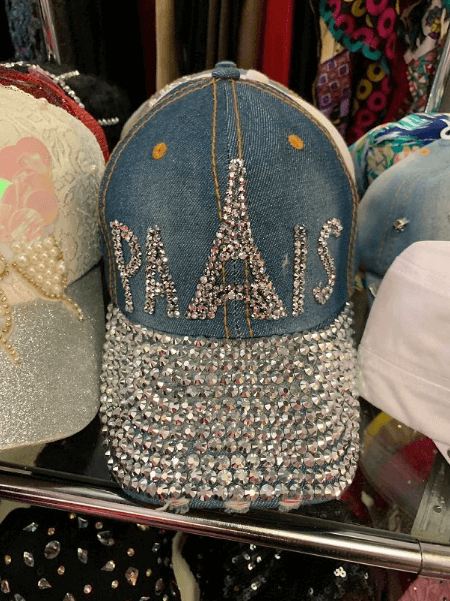
Someone forgot a letter.
9. Where can I find these shoes?
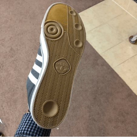
Those are certainly anti-slip.
10. Strange patch
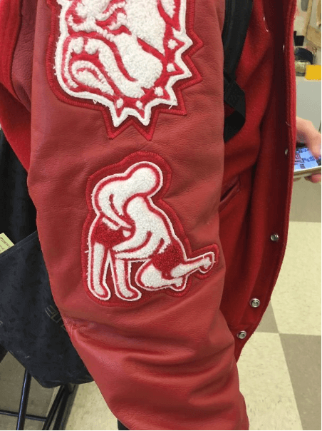
What are those guys doing?
11. The design speaks for itself
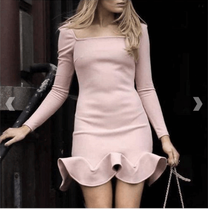
Who let that one slide?
12. Wait a minute
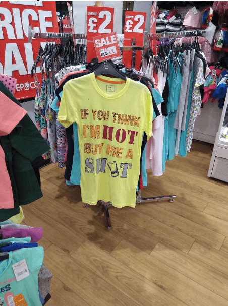
What should I buy?
13. The back looks pretty bad
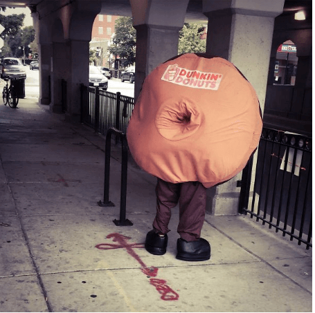
He should just stand in front of a wall.
14. Just throw it away
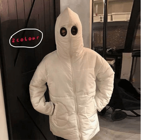
You shouldn’t wear that ever again.
15. The explorer
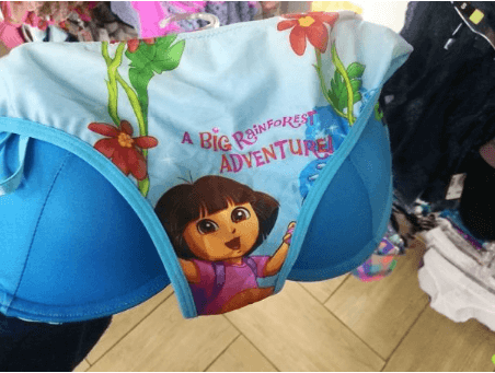
I’ll avoid that adventure.
16. Are those tights?
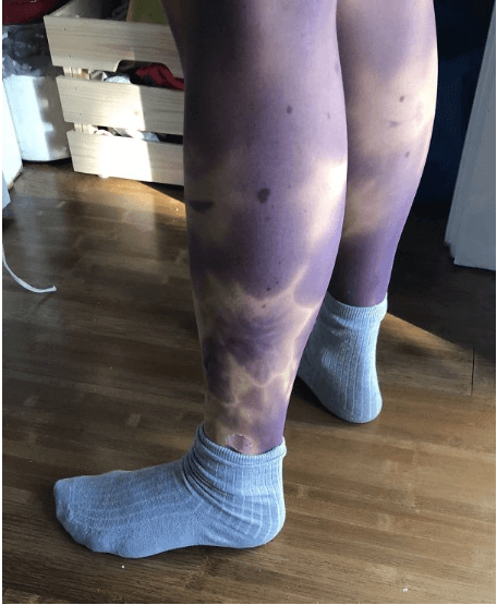
It looks like serious bruising on her legs.
17. Don’t buy that
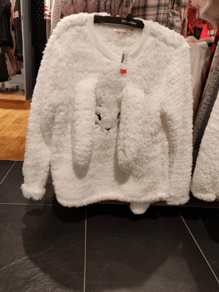
Those bunny ears are in the wrong place.
18. False advertising
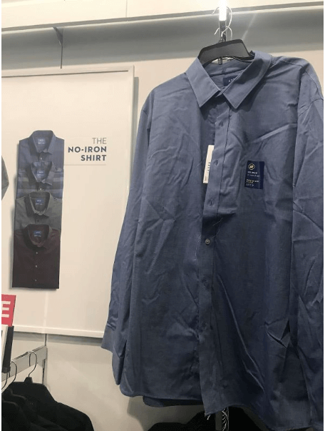
That looks like it needs ironing.
19. Who would wear that?
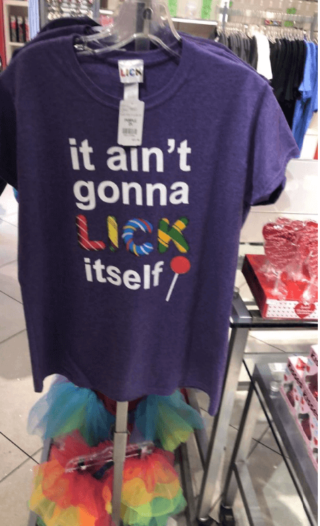
Just burn this shirt.
20. Font size
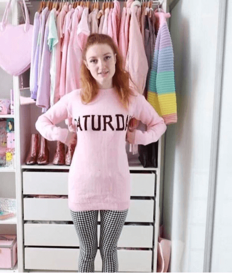
Maybe they should have used a smaller font for this one.
21. Super Mario
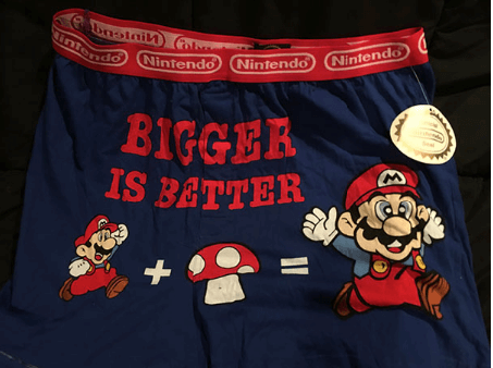
That is not what happens when you eat mushrooms.
22. NYC or London?
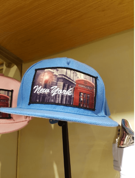
They don’t have those telephone booths in NYC.
23. Not there
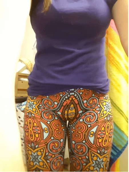
That design shouldn’t be on leggings.
24. Wait, what?
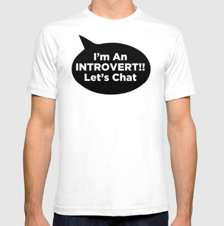
Let me read that again.
25. Bad logo placement
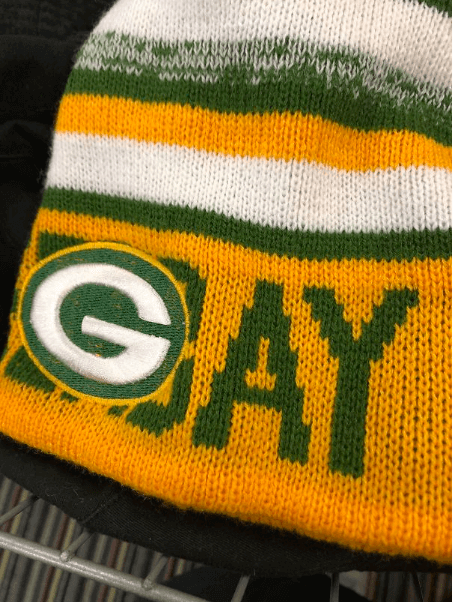
Should have moved it a bit.
26. Just give up
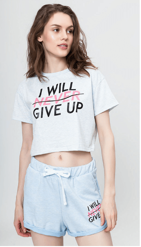
Was it meant to be like that?
27. Patterns
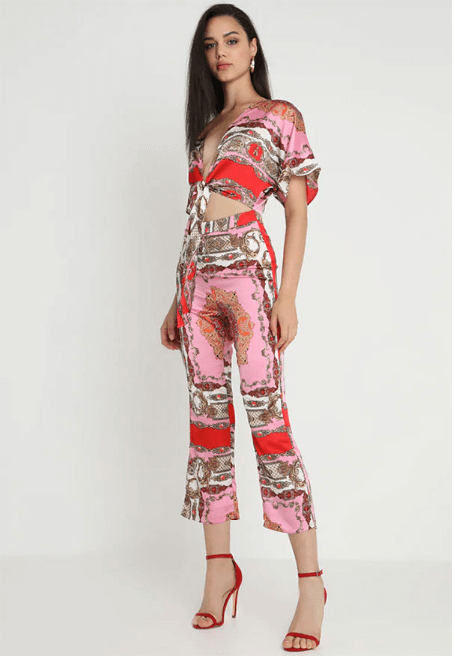
The pattern is just wrong.
28. Get rid of them

Take them off the shelf already.
29. Who thought that look nice?
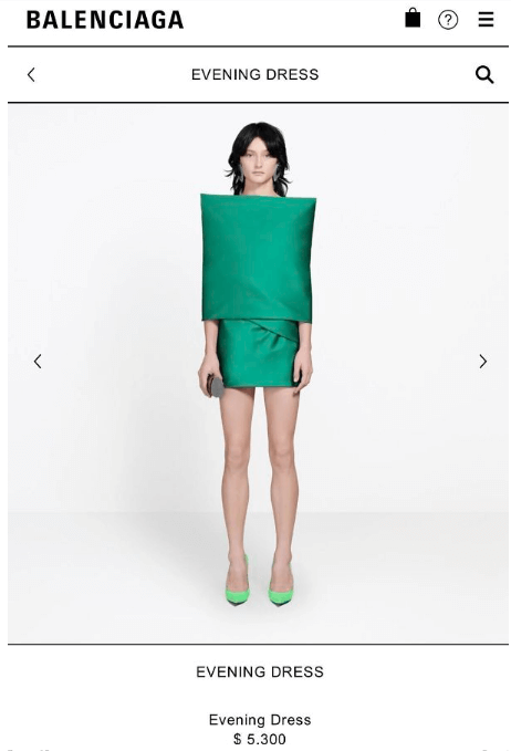
The model on the photo looks like a Christmas cracker.
30. Is that the logo?
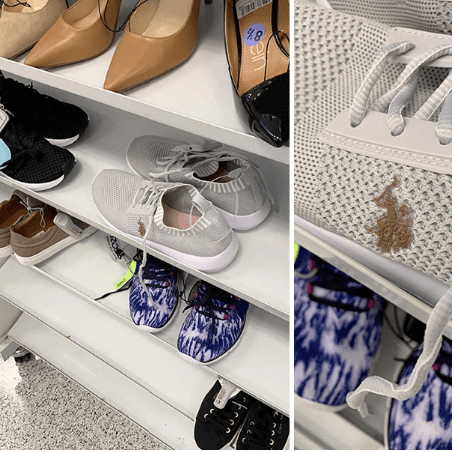
Not sure if they are stained, or that is just the logo.
 Viral Hatch US/UK No.1 News Portal
